Your wedding invitation is the very first glimpse guests get of your big day. Before the dress, before the décor, before the venue—this little envelope sets the tone. It tells people whether your wedding will feel romantic, modern, playful, or timeless. And the good news? You don’t need a massive budget or graphic design skills to create invitations that feel thoughtful and unforgettable.
Start With Your Wedding Theme and Mood
Before picking fonts or colors, get clear on the feeling you want your invitations to give.
Ask yourself:
- Is your wedding formal or relaxed?
- Indoor ballroom or outdoor garden?
- Daytime celebration or evening affair?
Style shortcuts:
- Classic weddings → serif fonts, neutral tones, clean layouts
- Boho weddings → soft colors, handmade textures, floral elements
- Modern weddings → bold fonts, minimal layouts, strong contrast
- Rustic weddings → kraft paper, earthy tones, organic details
Once your mood is clear, every design choice becomes easier and more intentional.
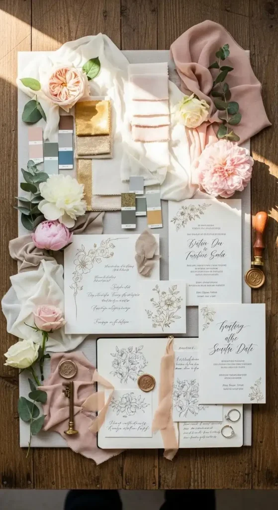
Choose a Color Palette That Feels Cohesive
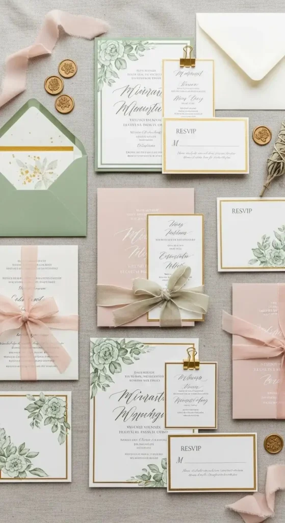
Color does a lot of visual work, even when used sparingly.
Simple color tips:
- Stick to 2–3 main colors
- Use one neutral as a base
- Add one accent color for interest
If your wedding colors are bold, let the invitation soften them. If your wedding colors are neutral, your invitation can carry a little contrast. Always test how colors look in natural light before finalizing.
Pick Fonts That Are Easy to Read (and Still Beautiful)
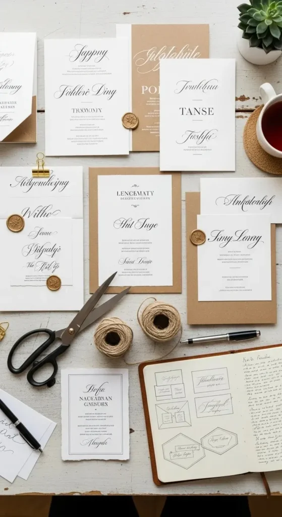
Fonts can make or break your invitation.
A safe formula:
- One decorative font for names
- One clean font for details
Avoid using too many styles. Two fonts usually feel balanced and polished. Print a sample and read it from arm’s length. If guests have to squint, it’s time to simplify.
Decide on the Invitation Layout and Size
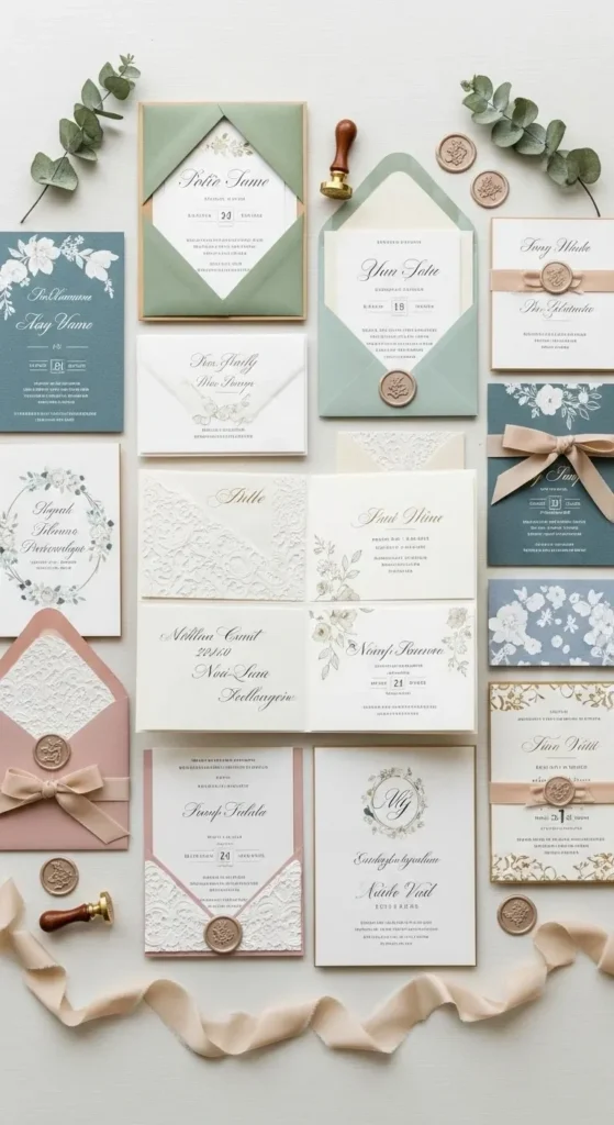
Layout affects how luxurious or casual your invitation feels.
Popular options:
- Single flat card (clean and budget-friendly)
- Layered cards with backing
- Folded invitations for formal weddings
- All-in-one invites with RSVP sections
Leave white space. Crowded text makes invitations feel overwhelming. Less content often looks more refined and easier to read.
Add One Standout Detail for the “WOW” Factor
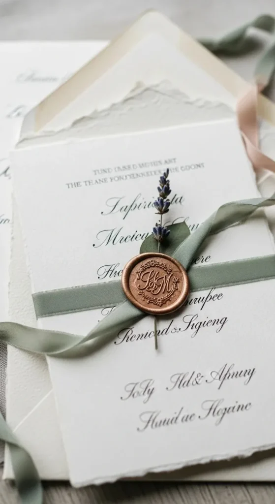
You don’t need ten extras. Just one thoughtful detail makes a big impact.
Ideas that feel special without being overdone:
- Wax seals
- Envelope liners
- Handmade paper
- Ribbon or twine
- Gold foil accents
Choose one element that fits your style and repeat it subtly across your stationery for a cohesive look.
Don’t Forget the Envelope Design
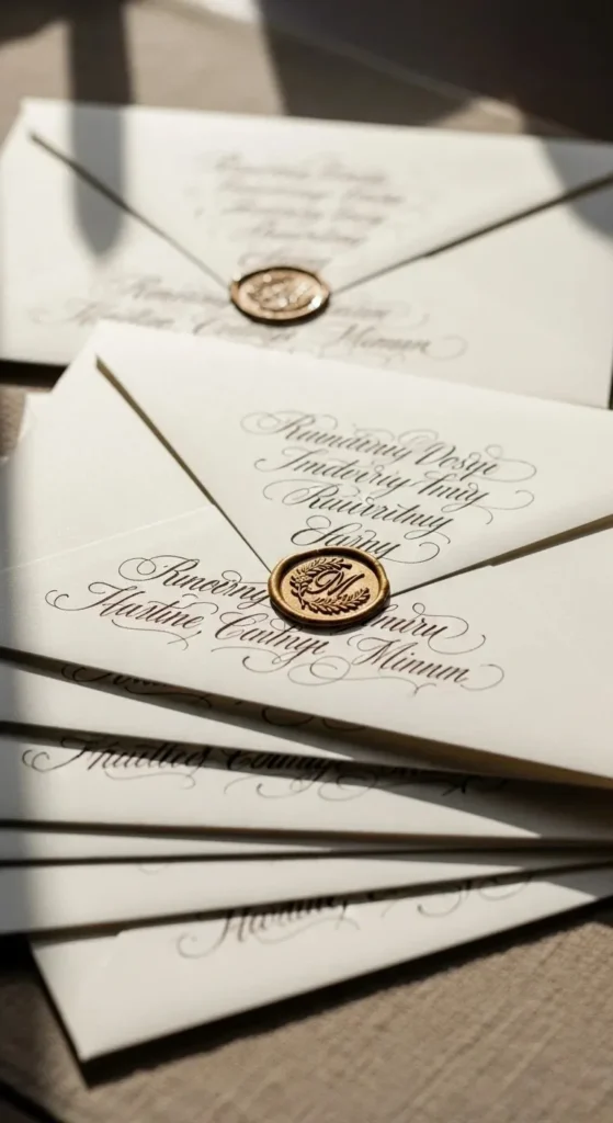
The envelope sets expectations before it’s even opened.
Envelope touches that stand out:
- Calligraphy-style addressing
- Colored or lined envelopes
- Matching stamps
Even simple invitations feel elevated when the envelope looks intentional. If hand lettering isn’t an option, many fonts mimic that look beautifully.
Include Only the Information Guests Truly Need
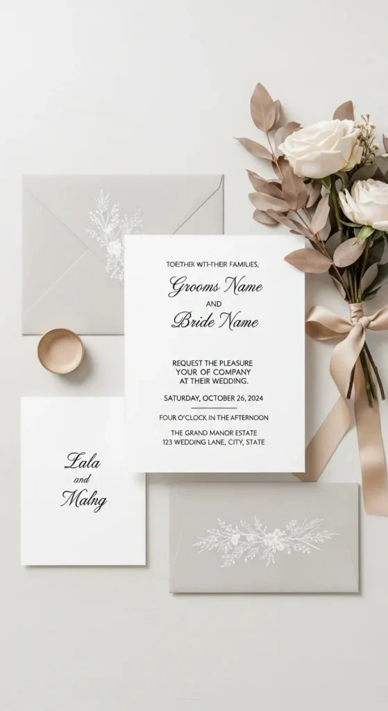
Clear information matters just as much as pretty design.
Make sure these details are easy to find:
- Names
- Date and time
- Venue and city
- RSVP instructions
Extra details like dress code or maps can go on a separate card or wedding website. Keeping the main invite clean helps it feel elegant and easy to understand.
Order a Sample Before Printing Everything
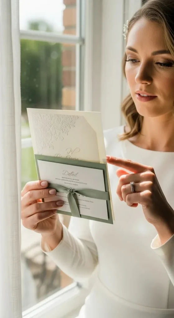
Always see and feel your invitation first.
Check:
- Paper thickness
- Color accuracy
- Font size
- Spacing
This step helps avoid expensive mistakes and last-minute stress.
Final Thoughts
Wedding invitations don’t need to be complicated to be stunning. When your design matches your wedding style, uses thoughtful details, and keeps things clear, guests feel excited before the big day even arrives.
💌 Save this guide for later, pin your favorite ideas, and start designing invitations that truly feel like your love story.